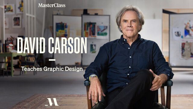
David Carson was born in Corpus Christi, Texas, in 1954; his father, a test pilot, worked on NASA’s early lunar landing program. But David preferred surfing to the skies, so he made his way to Southern California, where he studied at Fullerton College and San Diego State University, earning top marks and a sociology degree. It gave him a keen understanding of how individuals communicate with society and sharpened his research and critical evaluation skills.
After finishing his bachelor’s degree, David taught sociology at Torrey Pines High School near Del Mar, California. He immersed himself in the regional culture—at one point, he reached the top level of the state’s pro surfing circuit—and didn’t take a graphic design course until the age of 26, when he spotted a listing for a two-week class at the University of Arizona, taught by artist and designer Jackson Boelts. The work struck a chord; David enrolled at a small art school in Oregon and, the following summer, signed up for a three-week workshop in Switzerland.
Internship – Learning the Trade
The workshop’s instructor, accomplished typesetter Hans-Rudolf Lutz, didn’t shy away from design experimentation and European avant-garde theories. David was hooked. When he returned to the U.S., he took up as an intern at Action Now (née Skateboarder), a magazine focused on extreme sports. But he didn’t truly come into his own until 1984 when he was named art director of Transworld Skateboarding.
In 1989, he left to join Musician magazine in Gloucester, Massachusetts, later relocating to New York to work on SELF magazine. He then headed back west to join the upstart magazine Beach Culture as art director; the title folded after just six issues but won numerous awards, including Best Overall Design and Cover of the Year from the Society of Publication Designers in New York. That success led to a stint at Surfer magazine, where David spearheaded an imaginative redesign. He began to solidify his reputation as a thoroughly revolutionary figure in graphics and editorial.
His outsider aesthetic came into full view in 1992, when he was hired to design a fledgling alternative music magazine called Ray Gun. The publication’s subject matter and conceptual leanings proved a perfect fit for David’s style and attitude; he effectively invented a new visual language within the print medium, one characterized by rich texture, visual distortion, and the deconstruction and reconstruction of typographical and photographic elements. Above all else, he championed a holistic concept of visual communication.
Creative Review magazine describes David as “the most famous graphic designer on the planet” and “the art director of the era”
Today, David continues to build on his prolific body of work, hosting design workshops around the globe. He has published four books; worked with David Byrne, William S. Burroughs, and the estate of Marshall McLuhan; and won more than 240 awards, including the prestigious American Institute of Graphic Arts gold medal in 2014. His work now resides in the permanent collection of the Library of Congress.
David Believes that outstanding design is intuitive, personal, and communicative. It doesn’t require formal training, and it certainly isn’t downloaded from a template.
The Grid
The “grid” is a two-dimensional framework of intersecting lines that helps designers organize content on a page. The idea is to create layouts that are both legible and aesthetically pleasing without demonstrating the existence of the framework underpinning the whole thing.
David’s humanist approach—technically “incorrect,” yet inarguably successful—upended the system. He showed a new generation of designers that they didn’t need to stick to rules about image placement and consistent typography. David has no formula, gridded or otherwise. He starts each design from scratch, simply working in response to the goals of the project.
With the font choice, don’t overlook the message behind each font. They all have their own personality, and you have to decide, as a designer, which one fits your particular project the best—one which doesn’t simply carry the information. It’ll help you reinforce a message.
The Art of Seeing : Use your everyday surroundings to ignite creative inspiration
The best ideas, as the old cliché goes, come when you aren’t looking for them. But those ideas are rarely the result of idleness or passivity. They’re the product of viewing the world—consciously or not—with an eye for depth and detail. They require that you recognize emotional resonance and make cognitive leaps that forge creative connections that no one else would make.
Long Form Writing
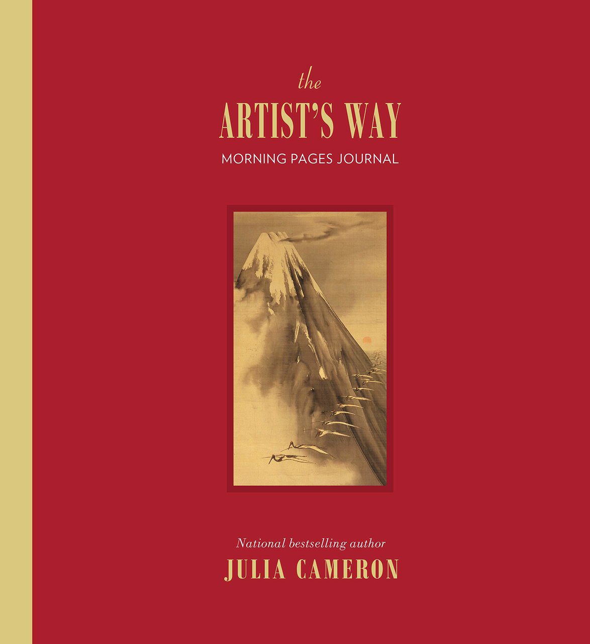
Similarly, creatives across all disciplines have espoused the virtues of writing longhand, particularly through the Morning Pages ritual, popularized by Julia Cameron’s 1992 book, The Artist’s Way. The exercise simply involves filling three sides of A4 paper with words (using pen or pencil and kept private) as soon as you wake up. The aim is to write without thinking, stream-of-consciousness style.
According to Cameron, there’s “no wrong way” to go about it, but she adds that “the second page-and-a-half comes harder” than the first, and three pages is the absolute limit, to avoid “self-involvement and narcissism.” Those who swear by the practice extol its virtues for calming anxiety, resolving creative problems, and leading to fresh insights.
The Morning Papers ritual must be undertaken immediately upon regaining consciousness. This is crucial, and similar meditative activities can be incredibly powerful when the brain is still a little sleepy; we’re less inhibited then, meaning revelations are more forthcoming.
Environment Awareness
Awareness is crucial to developing your design eye, and found imagery can serve as a source of inspiration. David often photographs the man-made details of his everyday surroundings, from community posters to graffiti tags. Walk around your own neighborhood and inspect the text elements—flyers stapled to telephone poles, signs for yard sales, posted notices—and photograph them. Then do the same on a different day while exploring a new neighborhood.
Compare the results. How does each object use typography? What message is being conveyed? Which ones are effective? Which aren’t? What aspects (literal or figurative) might you be able to translate into one of your own designs?
The Business of Design
When designers win work (i.e., get hired to take on a project), it’s not always a result of being approached directly by the client. There are several ways for a designer to be commissioned. They might work through something called a tender—invitations from public- and private-sector businesses to bid for design projects, as listed on sites like Creative Tenders and Global Tenders. These jobs will include a tender request document, explaining what services they require, with specific instructions and desired criteria.
Occasionally, designers can also win business by working “on spec,” a term derived from the word speculatively. Here, the designer has already created something independently, approaches a person or company they’re keen to work with, and pitches the work in the hope of being commissioned. More established designers do have a better chance than unproven names in this arena, but the risk is fairly obvious—if the client isn’t interested, you’ve exerted a huge effort with zero return on your project. It’s a bit like cold-call sales: difficult but possible.
When a client does approach a designer or studio directly, the work can still require a lengthy pitch process.
Doing the Work
Everything starts with the brief—a description of what’s needed from the designer. For some clients, this will be a comprehensive document, packed with information that outlines each touchpoint the designer will work on; maybe it’s a one-off magazine cover, or maybe it’s an entire branding scheme, including logo, store signage, staff uniforms, and an app icon. For other clients, the brief could just begin as a verbal request; in that case, it’s on the designer to find out exactly what’s needed and how it fits the client’s attitude, selling points, target consumer, or audience.
- Interrogate the Brief
Ask Questions
The designer has to start asking questions: Who is this client? What are they trying to say? What are the benefits of their product or the service? Who is their audience? The first ideas for a project, whether those are strategic or visual, can only come from thoroughly investigating these lines of inquiry through both micro and macro lenses.
Read the Brief
“Read that brief. Read it well. And what do you get from that? What are you seeing? What are you feeling?”
The design elements you create—logos, typography, color palettes, illustrations, photographs—should address the issues presented in the brief. But the brief alone is rarely enough, and a good designer won’t take everything at face value. They’ll investigate the client’s origin story, the competitors (and how they’re faring), the main audience, and new audiences they’re intending to reach. Looking back on the client’s previous design work can also inform its future: what worked and what didn’t, and why.
Research your Client
Following the research phase, the next step is “gathering materials you think can ‘reinforce’ the brief and answer the questions it brought up,” David says. “Then it’s a matter of letting your design mind go to work.”
2. Give them options (and make sure that they actually like all of them)
When it comes to presenting initial ideas to a client, one school of thought advises that a designer should bring only their best ideas—three at the most. David disagrees. He says that he’s always worked by showing an array of different concepts, “maybe because I’ve been doing it for a while and I don’t feel any one project is that precious.… Some are safer, some are more out there, some are all in between.” The trick to avoiding that is to actually like everything you decide to present.
“give ’em some options… show the ones you really feel passionate about, and ones that you feel good about but are a little safer, and go from there.”
3. Know your strengths, but push yourself creatively
Whatever your creative field, self-awareness is key. While everything you do for clients should fit the brief, you were likely hired because they spotted something about your style, process, and chosen mediums—so play to those strengths.
4. Be able to justify every element
It’s all well and good to present several potential design routes at an early client meeting, but that work can be easily undone if, when questioned, you can’t justify why you proposed these ideas. Simply liking a certain color or typeface doesn’t cut it. Every design decision has to be arrived at through a considered process, whereby you can justify why it would be a smart approach for that particular brand, brief, or project
5. Original Design work comes from authenticity
Good creative is the product of unique perspectives, so take advantage of yours. Don’t just reinforce the norms of what’s been seen before for a particular sector or type of client. Authenticity sells.
6. Use your work for good, not just a payout or portfolio piece
Eventually, most successful designers struggle to strike a balance between taking on projects to pay the bills and doing ones they genuinely enjoy. They’re likely to face difficult ethical decisions, too. Some designers and agencies now flat-out refuse to collaborate with companies that don’t practice climate consciousness or have poor working conditions in their factories.
In many cases, as a creative, you can make small but significant changes; remember, you’re in a unique position as someone charged with making images for public consumption. Tackling social issues from the inside, as a sort of graphic design Trojan horse, can go a long way toward effecting change.
7. Make your work visible
You could be the best designer in the work, but if nobody sees the work, it’s gonna be difficult.
Obviously, a decent website, social media presence, and robust online portfolio are key today, But more traditional routes, like face-to-face meetings and design competitions, can still do the heavy lifting in getting your name out there- and winning new business.
Books
- Branding: In Five and a Half Steps by Michael Johnson
- Logo Modernism by Jens Müller and Julius Wiedemann
- How to Be a Graphic Designer Without Losing Your Soul by Adrian Shaughnessy
- Ways of Seeing by John Berger
- How to Use Graphic Design to Sell Things, Explain Things, Make Things Look Better, Make People Laugh, Make People Cry, and (Every Once in a While) Change the World by Michael Bierut
- The End of Print: The Grafik Design of David Carson by Lewis Blackwell
- The Art of Looking Sideways by Alan Fletcher
- A Designer’s Art by Paul Rand
- The Graphic Language of Neville Brody by Jon Wozencraft
- Things I Have Learned in My Life So Far by Stefan Sagmeister
- Interaction of Color by Josef Albers
Websites
Free Online Archives
- Letterform Archive
- AIGA Design Archive
- Van Alen Institute Design Archive
- The Saul Bass Poster Archive
Magazines
Podcasts
- Typeradio
- Design Matters
- Arrest All Mimics
Recommended
MasterClass is a streaming platform that makes it possible for anyone to learn from the very best. MasterClass is an online membership – accessible on your phone, web, Apple TV, Roku devices, and Amazon Fire TV – that offers classes on a wide variety of topics taught by 90+ world-class masters at the top of their fields.
Their immersive learning experiences combine incredible video content, downloadable materials, and social interaction with the MasterClass community, all of which users can explore at their own pace.
The annual membership is available for $180 USD, which allows unlimited access to ALL on demand MasterClass content for the year
Give One Annual Membership. Get One Free.
All the best in your quest to get better. Don’t Settle: Live with Passion.
For More Information: MasterClass Home Page


Comments are closed.